

Ambient lighting has a great impact on LED display screens. Natural lighting, that is, sunlight, is varied.
During the day, the sun is strong, and the display screen must be bright; otherwise, it will not be clear.
In the evening, it is dark, and the brightness must be reduced, otherwise it will be dazzling; at night, it is dark, and the brightness must be lowered again, otherwise it will be dazzling.
Artificial lighting, such as street lights, is relatively stable, but it is easy to form light spots on the screen, which is uncomfortable to watch.
Now, there is dynamic lighting adaptation technology, and the LED display screen can automatically adjust the brightness according to the light.
The light sensor is like a small eye that can sense the intensity of light and then tell the control system to adjust the brightness.
For example, if the light is strong during the day, it will be brighter, and if it is dimmed at night, the screen content will always be clear, and the eyes will not be tired.
The light intensity feedback mechanism is even more considerate, and it will further optimize the brightness according to people’s visual perception.
If the driver feels that the screen is dazzling, the system will automatically lower the brightness until it is suitable. In this way, the screen is clear and comfortable, and the driver can drive more safely.
This technology can not only enhance the visual experience but also reduce visual fatigue and improve driving safety.
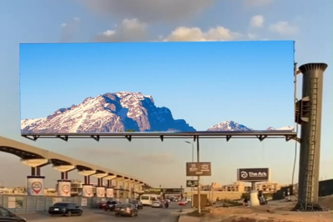
1). Visual optimization of text and graphics
On highways, drivers have to keep their eyes on the road at all times when driving, so the text and graphics on the LED display must be clear at a glance.
The text size is very important. If it is too small, the driver cannot see it clearly, and if it is too large, it will appear inconsistent.
Generally speaking, it is determined according to the distance between the screen and the driver.
For example, on the large screen on the side of the highway, the text height must be at least one meter, so that the driver can see it clearly from a distance.
The font is also critical. Fonts with thick lines, such as bold and black fonts, look clearer and are easier for drivers to recognize.
Graphic symbols must also be simple and clear, and it is best for everyone to understand them at a glance.
And they must meet the standards, such as the familiar graphics of traffic signs. Sometimes, combining graphics and text will have a better effect and allow drivers to understand the information faster.
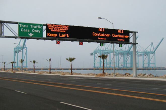
2). Information update frequency and visual interference
It is not good to update information too quickly. When driving, the driver must focus on the road.
If the information on the screen changes from time to time, the driver’s attention will be distracted, which may lead to danger.
Therefore, the appropriate frequency should be paid attention to when updating information.
Studies have found that when driving, drivers may be distracted by roadside signs about one-third of the time.
If there is too much and too complicated information, the driver will spend more time looking for and reading information, and their eyes will be away from the road for longer, which is definitely unsafe.
Therefore, when updating information, it should be determined according to the actual situation.
For example, important traffic warning information can be updated more frequently, because drivers must know this information immediately, and general prompt information does not need to be updated too frequently.
In short, a reasonable arrangement of the frequency of information updates can enable drivers to obtain information more safely and reduce visual interference.
1). Physiological mechanism of visual fatigue
Staring at the LED screen for a long time will make the eyes feel very tired, which is mainly due to the blue light emitted by the screen.
Blue light will stimulate the retina in the eye, making the eyes particularly prone to fatigue.
Moreover, if you stare at the screen for a long time, the ciliary muscles in your eyes will be tense all the time, and they will become “stiff” over time, and your vision will become blurry, and you may even become nearsighted.
Therefore, it is important to study the early warning indicators of visual fatigue. For example, the critical flicker frequency (CFF) is a good indicator.
Simply put, CFF is the degree to which the screen flickers before the human eye feels that it is always on.
When you are tired, this frequency will become lower. There are also higher-order aberrations and adjustment capabilities of the eyes, which can also tell us in advance whether the eyes are tired.
2). Visual comfort design principles
In order to make the eyes look comfortable, the design of the LED screen is also critical. First of all, the flicker frequency of the screen is very important.
If the screen flickers too slowly, the eyes will be very tired. Therefore, the flicker frequency of the screen should reach the critical frequency at which the human eye feels that it is always on, so that the eyes will not feel tired.
In addition, the refresh rate of the screen is also very important. The higher the معدل التحديث, the less the screen flickers, and the more comfortable the eyes are.
Studies have found that the higher the refresh rate, the lighter visual fatigue. Therefore, when designing LED screens, try to increase the refresh rate to make the eyes more comfortable.
By rationally designing the flashing frequency and refresh rate of LED displays, visual fatigue can be effectively reduced, making the eyes more comfortable and protecting eye health.